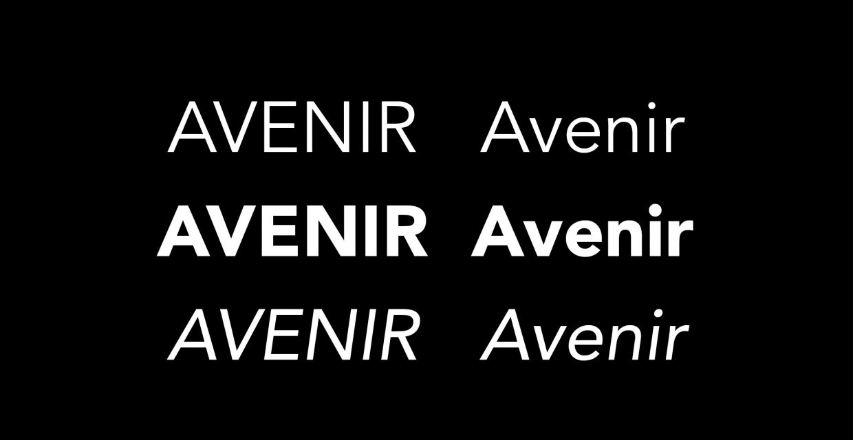
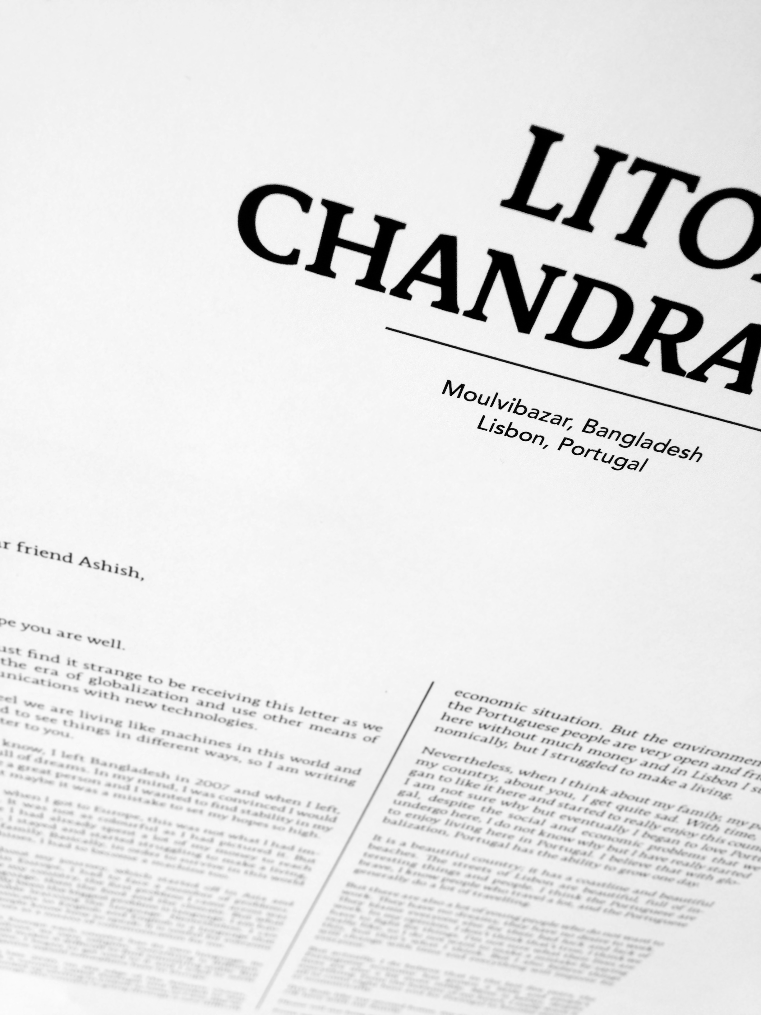
We have chosen two typefaces: Stuart as the principal and Avenir as a secondary typeface. In our project, The Encyclopedia of the Migrants, we use Avenir[1] for all subtitling, specifically the geographic location of the witnesses.
The creator of Avenir, Adrian Frutiger[2], was inspired by the Futura font (1927) in the creation of this new typeface. A Swiss type designer, creator of fonts and of logotypes, he studied sculpture, illustration, gravure and calligraphy. These specialities led him to work into a Parisian foundry. Frutiger is considered one of the greatest creators of typefaces of the twentieth century. He has created many typographies, among which feature Frutiger, Univers, and, of course, Avenir.
Created in 1988, Avenir looks like a geometric sans-serif but is not totally geometric. Indeed, it contains elements of Old-style, or of calligraphic style. The upper-case are reserved for the titling because they are classy and stable. The lower-case has the advantages of the typefaces geometric sans-serif but without the inconveniences. The lower-case has a better visual harmony and it is easier on the reader’s eyes. This is why Avenir is used in short texts, such as for instance in journalism.
At the beginning of our research work, we had thought about using the Univers[3] font. Created in 1967, specifically for use on IBM typewriters, this typeface marked a turning-point in typography history. Univers is the first typeface to be declined in several weights (twenty-one) and now constitute a classic of contemporary typography thanks to its precise drawing as well as its practical and original aspect.
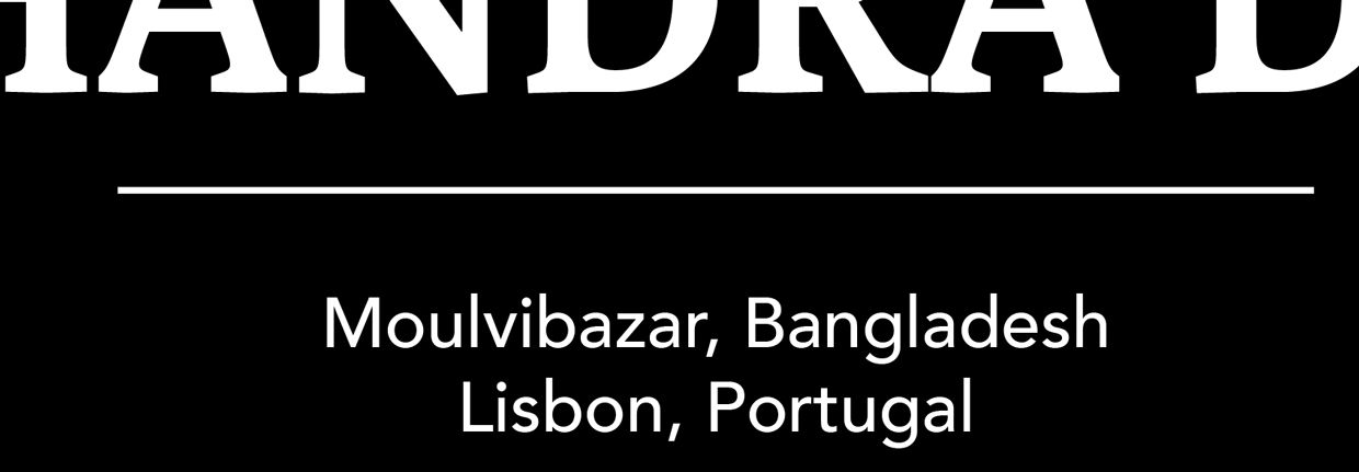
As we want to anchor our project in modernity, the use of Univers would be a good choice. Nevertheless, we have taken the advice of Lénaïg Friguel (student at LISAA, graphism school) and opted for Avenir. This typeface with serif reminds us of the Enlightenment and world of Diderot and d’Alembert, the fathers of the Encyclopédie. Avenir also combines very well with Stuart. The Encyclopedia of the Migrants keeps this humanistic aspect, while sticking to the present. It preserves a Renaissance spirit with its paper support but is definitely anchored in the Digital Age thanks to its contemporary fonts.
[1] The word avenir is French for “future”.
[2] Who died in September 2015.
[3] Classified as a Neo-grotesque sans-serif typeface.