We all know the fonts we use everyday: Arial, Times New Roman or Georgia are the best known of these. Despite the fact they already are on our computers, these fonts are the result of rigorous graphic work. They are linked with the history and the evolution of printing techniques.
 Previously the expression “type designers” was used to nominate the printer and the fonts creator, who was the same person. Now, type designers are the people who imagine, invent and create new fonts. Their work is based on the classification of typeface setups of the nineteenth century. It is hard work because every type designer must pay attention to countless details. For example, the font must be visible regardless of its body or its weight. In essence, it is all about reinventing the drawing of letters to adapt them to new situations. Because, finally, the first goal of a type designer is to attract and captivate the reader.
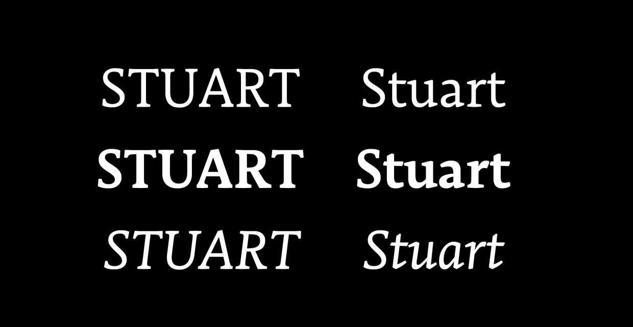
In the case of our project, The Encyclopedia of the Migrants, we have chosen two fonts: Stuart as the principal font and Avenir[1] as secondary one. Stuart is used for long texts and for titles (in our project, first names and names are treated as titles). The creator of Stuart, Matthieu Cortat is behind the site nonpareille.net and he proposed about twenty original fonts. He was born in 1982, in Switzerland and now lives in Lyon (France), where he is a designer and type designer. He also offers classes at schools and conferences at The Museum of Printing and Graphic Communication in Lyon.
Stuart belongs to the Old-style family that we also call Venetian. The fonts of this family owe their origin to the typographic creations of the Fifteenth Century and are inspired by the humanist texts of the Middle Ages[2]. The lower-case derives from the “Carolingian minuscule”, the script introduced by Charlemagne, while the upper-case derives from Roman letters. Nowadays, the Old-style is very little used and have almost disappeared from the publishing industry. We now only find it in Renaissance books.
The project of The Encyclopedia of the Migrants has chosen Stuart for its constant reference to typography history and its contemporary drawing. Indeed, this typeface is used both for physical mediums and numerical projects, which therefore integrates it in with modernity. For example, the serif of Stuart, who is the mark of all printer typefaces, is better for reading. The reader’s eyes are not tired. Furthermore, the resemblance of Stuart with the typographies of the Renaissance links this font to the famous Encyclopédie of Diderot and d’Alembert, two of the great thinkers of the Enlightenment.
[1] An article about this font will be posted soon.
[2] The word “humanist” derives from the Latin, umanista and means the teacher who teaches grammar and rhetoric. For example: Rabelais, Érasme or Dolet.